[vc_row][vc_column][vc_column_text]
The BCELM Theory behind the Montreal Expos Logo
by Denis Lagacé
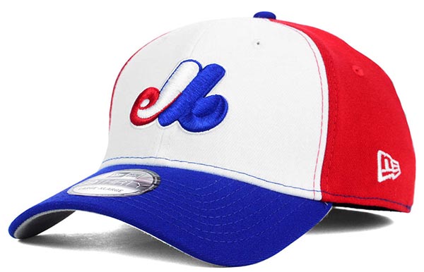
The shrouded mystery that is behind the Montreal Expos logo is ever present almost 50 years after is was released. I think you can find it on every single countdown of the best-hidden images or best logo lists on the internet. The red, white and blue coloured almost italic symbol is still today one of the most popular in Canada and Major League Baseball. You don’t have to go far to see that even today the logo is a still a moneymaker. The tri-coloured hat is currently on the first page of the shop section of the National Baseball Hall of Fame along the Brooklyn Dodgers and Boston Red Sox. In a 2014 Adam Gopnik article named Expos Nation (https://thewalrus.ca/expos-nation/) Charles Bronfman indicates that even he, the owner back then of the Expos, doesn’t even remember who created the logo. “It was a design firm in Toronto and I can’t recall his name”. No one has ever taken credit for the logo or even better presented the public with the creative process behind the logo.

Montreal Expos
B – Bronfman or Baseball
C – Charles
E – Expos or Ellen (as in Ellen Bronfman, daughter of Charles)
L – League
M – Montréal
The interesting thing is that the public doesn’t seem to mind the explanation or lack of when it comes to appreciating the original logo or the 1992 version. Chris Creamer the Founder of SportsLogos.Net, says: “I allow users on the site to share their ratings of any logo on the site. Based on those results, the Expos original primary logo would be ranked 5th in MLB if it were in use today, the logo they switched to in 1992 would rank 2nd – behind only the Toronto Blue Jays.” The mystique and thoughtfulness behind the logo probably is one of the reasons why it’s liked that much.

Milwaukee Brewers
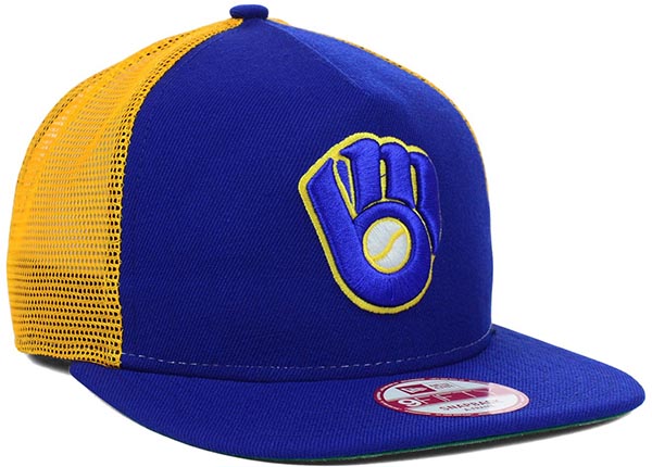
Other logos in Major League Baseball have also had that kind of appreciation since their first public appearances. In 1978 the Milwaukee Brewers unveiled their new logo. The baseball glove shaped logo with a baseball in the middle amazingly played with the initials of the team (B for Brewers and M for Milwaukee) to form the shape of the logo. In 94 the Brewers completely changed their colors and incorporated a gold, green, white and dark blue mix much of the disappointment of fans. Just imagine if the Expos changed their color to purple, teal, grey and white like a lot of teams did in the mid 90’s. The Brewers did bring back the retro baseball glove look in 2006 as an alternate retro logo and slowly it’s taking back its spot as a primary logo. During the 2016 MLB season every single specialty cap the Brewers will wear features the glove logo and not the normal capital M with the sprig of barley underneath. Who knows, maybe the glove logo is on a tryout.

Arizona DiamondBacks
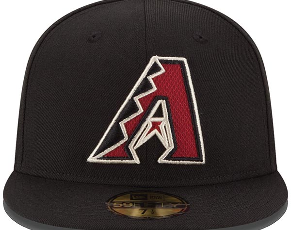
According to Chris, another logo is also getting attention from fans, the Arizona Diamondbacks’ stylish A. “The Arizona Diamondbacks have hidden imagery in their logo, the space inside the “A” forms the head of a snake, yet somehow doesn’t get quite the praise as the retro logos do.” As Chris said, sometimes a logo needs to be replaced in order for people to appreciate it more as it was the case for the Brewers. The D-Backs have been in the news for other reasons this year as major sports journalists have criticized their drastic and futuristic change of uniforms. The white uniforms are sometimes called a copy of Curt Shillings’ Bloody Sock moment from the 2004 American League Final. Maybe a rebrand will come sooner than most people think.
When allowing Chris to dream about the return of the Expos I asked him what would be his personal preference as a uniform for Nos Amours he didn’t consider it was necessary to do something too drastic. “Something similar to what they wore in their final seasons, pinstripes and all, that was a great look for the club. You could modernize it slightly if you felt it *had* to be different, but I wouldn’t do much to it. Throw in an alternate uniform and find a use for that fantastic retro pinwheel cap and you’ve got a winner.”[/vc_column_text][/vc_column][/vc_row]

